20 Sep Hero Images and How to Use them Effectively
A PICTURE PAINTS A THOUSAND WORDS – this phrase has not only been used in paintings, photographies, and such. It is now used in web designs, and yes, it has been working effectively for many well-marketed companies! There are just so many things that images can explain more than words can describe.
One of the popularly used web design trend this time is by using hero images. It’s been widely applied to capture the attention of website viewers and played a big role in inviting them to browse and read more about the company. This article will discuss all about hero images and how to use them effectively in web design.[/vc_column_text]
What is a Hero Image?
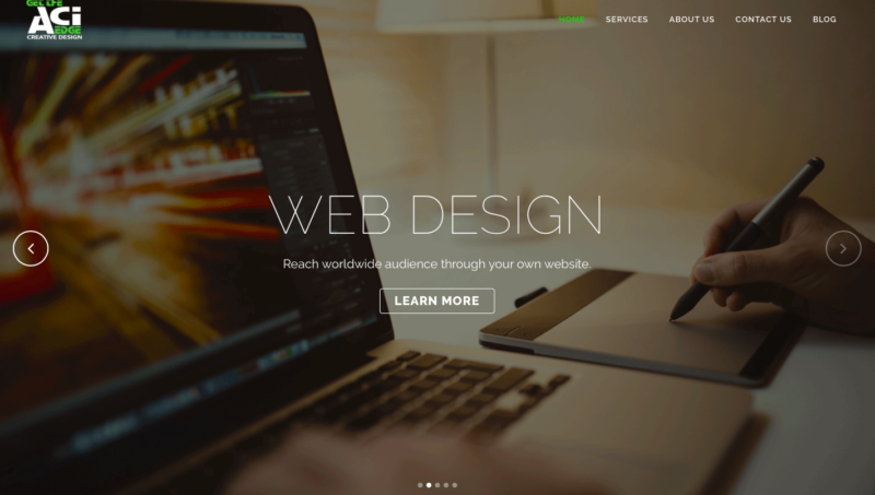
Hero image is not a gallery of people sacrificing for a cause, neither is it an image of a popular character from DC or Marvel. Hero image is best described as large full-screen image headers containing some content about the company’s line of business. Also, it is not limited to headers only, but are now commonly used as web page background with few texts or buttons that make efficient usage of the website. These images promote products and services; it basically communicates the cause of the company to its viewers. (source)
Why is it called a Hero Image?
The world of theatre first used the term “hero prop,” which pertains to a prop that’s meant to be seen closer to the camera or audience to magnify its more detailed pieces. Examples of hero props are lights, moving props, or any items carried and used by the main character in the film or television (source). Relating to web design, a hero image was coined after the term hero prop and is basically used in highlighting the main purpose and description of the company’s line of business.
Why use Hero Images?
If used properly and appropriately, hero images can bring great impact on business marketing. The following are some reasons why every website should consider using hero images.
- Creating personal touch – There are a lot of marketing styles applied today, but none compares to having the feeling of personalization given by companies to its viewers and customers. Using hero images adds a personal touch and greater depth of visual connection between the customer and the vendor.
- Branding – Using hero images showcases the company’s portfolio and services rendered to its customers.
- Ease of use – Hero images direct or walks through the visitor to a company’s desired content and link easily.
- Gateway for numerous channels of product presentation – Hero images is not an end in itself, but a linkage for more business transactions in a way that it can be used in emphasizing substantial information. Samples of this information are announcements, promotional teasers, highlighted services and products details, and such.
(source)
Why use Hero Images?
If used properly and appropriately, hero images can bring great impact on business marketing. The following are some reasons why every website should consider using hero images.
- Use a high-quality image – Low-quality images may give a poor impression about the company to its viewers. Make sure to use a high-quality image with large resolutions as this will impact the first few seconds of impression your website gives.
- Use a visually captivating image – People are triggered by beautiful and catchy images. They tend to spend more time watching new images than on reading texts. Using a captivating image will make your readers stay on your website and read more about what you can offer.
- Avoid using cluttered photos – Remember that hero images highlight the best detail of your company. Use minimal photos relevant to the subject. Avoid using a photo with numerous elements (line, color, shape, pattern, texture, and form). As much as possible, you’d want your readers to focus on your main content, not being distracted with so many details in one setting. Below is an example of an image with many unnecessary elements combined in one picture:

You wouldn’t want your readers leaving your website right after seeing this picture, would you?
Here is an excellent example of a minimalist image being used as a header in a website, pertaining and focusing only on the topic as presented:

- Add a call-to-action (CTA) – The main purpose of creating a website is to gain more clients. Adding a call-to-action link or button will tell and direct your visitors to take part in the company’s business. It brings about an interaction between the client and the vendor. An example of a best-used call-to-action is previewed below:

The CTA button above with the words “LET US LAUNCH YOUR BUSINESS” effectually maximizes the use of the Hero Image banner. It calls its viewers to take a step forward in launching their business.
- Be Creative – Hero image usage has been a trend, but experimentation of new ways is always welcome and that’s where growth evolves. Be creative, think outside the box, learn and re-learn, and use your freedom to beautifully express what your company presents. Inspire other designers to explore the world of web design!

Want a professional top quality web design? Norse Sound Creative offers not just that, but also an SEO-ready stylish website, creative and technically sound, user-friendly for your customers to enjoy!
Sign up here.


No Comments